When you look around the internet for reports, infographics, and other data regarding email marketing, you’ll find plenty of content covering the major KPIs that marketers typically use to measure the effectiveness of a campaign. Open Rate, Click Rate, Conversions and Conversion Rate, ROI, surveys about how businesses value email in the marketing mix, etc. But, one type of data you don’t see discussed very often is Unsubscribes or Opt-Outs.
Sometimes marketers like to focus on the positive metrics and may spend less time looking at the negative marketing signals being sent by a metric like opt-outs. However, there is plenty to be learned by examining opt-out behavior from your own email campaigns, and it can also be instructive to take a more holistic view of opt-outs across industries and from different geographic regions.
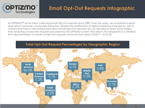
As a company that has been processing email opt-outs for almost ten years, we’ve learned a great deal about unsubscribe behavior around the world. We recently released an infographic that depicts some of the insights about a large sample of users who opted out of receiving emails over a recent 14-month period.
Geography
Not surprisingly, with email being a global marketing channel, opt-outs have been received from all over the globe. This includes unsubscribe requests from 192 of 193 recognized countries. Any guesses on which country might be missing? (Read to the end of this article, and we’ll share the country’s name.)
We’ve seen the same trend at a regional level, where opt-outs have come in from 6 continents (we didn’t receive any requests from Antarctica during the 14-month date range).
Most of the opt-outs came from North America (87{57b8cc37fd24bce1cf64c8b05d9407ce9171516056c1f5e762677747187a0de4}), and particularly the United States (86{57b8cc37fd24bce1cf64c8b05d9407ce9171516056c1f5e762677747187a0de4}), but Europe and the region including Australia and New Zealand also generated a higher percentage of unsubscribe requests than other parts of the world. The top 10 countries represented over 98{57b8cc37fd24bce1cf64c8b05d9407ce9171516056c1f5e762677747187a0de4} of all opt-out requests.
Technology
Another aspect of where opt-outs are coming from involves the email domain. The opt-out infographic shows that Yahoo! was the most popular email provider for opt-outs, at 32{57b8cc37fd24bce1cf64c8b05d9407ce9171516056c1f5e762677747187a0de4}, with AOL (16{57b8cc37fd24bce1cf64c8b05d9407ce9171516056c1f5e762677747187a0de4}) and Gmail (14{57b8cc37fd24bce1cf64c8b05d9407ce9171516056c1f5e762677747187a0de4}) taking up the other spaces in the top three. This stat is particularly interesting when compared to the overall popularity of these email providers. In the U.S. Gmail reigns supreme at 42{57b8cc37fd24bce1cf64c8b05d9407ce9171516056c1f5e762677747187a0de4}, followed by Yahoo! (16{57b8cc37fd24bce1cf64c8b05d9407ce9171516056c1f5e762677747187a0de4}) and Hotmail (6{57b8cc37fd24bce1cf64c8b05d9407ce9171516056c1f5e762677747187a0de4}). (2018 Global Email Benchmark Report – Sendgrid) So, it’s interesting to note that Yahoo! accounts for a disproportionately high number of opt-outs compared to its overall share of the market.
While the vast majority of opt-outs come from well-recognized and highly popular email providers, we also continue to receive unsubscribes for email addresses on platforms that many people may have thought were no longer active. This includes platforms like Prodigy and Lycos, which were giants in the earlier days of the internet. It’s a good reminder for marketers that legacy technology and platforms still need to be accounted for in new strategies.
This infographic is the first of three that OPTIZMO will be releasing this year. The next two infographics will focus on device usage, most common browsers and operating systems, and trends in the days and times opt-outs are received
You can download a copy of OPTIZMO’s Email Opt-Out Requests Infographic here.
…and to answer the question I mentioned earlier in the article. What is the one recognized country that did not produce an opt-out request during the infographic’s 14-month timeframe? North Korea.
